Understanding Visual Hierarchy: The Key to a Successful Website
Understanding Visual Hierarchy: The Key to a Successful Website
When you think about creating or redesigning your website, what comes to mind first? You might focus on the colors, images, or how flashy the layout looks. While all of those elements are important, there’s one fundamental piece of the puzzle that can make or break your website’s success: visual hierarchy.
At Bear Byte Studios, we’ve worked with businesses across Utah, from law firms in Salt Lake City to small local shops in Ogden. And one thing is always clear—if your website doesn’t have a strong visual hierarchy, you’re likely losing visitors before they even get to know what you’re offering.
But what exactly is visual hierarchy? Why does it matter? And how can it help you grow your business? Let’s dive in.
What is Visual Hierarchy?
Simply put, visual hierarchy is how elements on your website are arranged to guide users through the content. It’s all about creating a logical flow, ensuring that visitors see the most important information first and can easily navigate the rest of your site.
Imagine walking into a store with no signage, no clear path, and products scattered randomly. You’d probably walk out feeling confused and frustrated. The same thing happens online when users can’t find what they need quickly.
Visual hierarchy helps prevent that confusion. By strategically organizing your website’s design elements—headlines, buttons, images, and even whitespace—you can guide users to what matters most and encourage them to take action.
Why Does Visual Hierarchy Matter for Your Website?
Think about the last time you visited a website and quickly found what you were looking for. That seamless experience was likely a result of well-structured visual hierarchy. When done right, it creates a clear path for users to follow, ensuring they stay engaged and don’t bounce off your site.
A few years ago, we worked with a small ecommerce business in Utah that was struggling with high bounce rates. Their site had a lot of great content and beautiful images, but visitors just weren’t staying. After reviewing their website, we realized that the visual hierarchy was all over the place—there was no clear focal point or call to action (CTA). By rearranging elements, making the headlines larger, and adding contrast to key buttons, we were able to increase conversions by 40%.
That’s the power of visual hierarchy—it keeps visitors on your site longer and guides them to take action, whether that’s making a purchase, filling out a contact form, or signing up for a newsletter.
The Key Elements of Visual Hierarchy
There are a few key elements that make up a strong visual hierarchy. Let’s break them down.
Size and ScalE
Larger elements naturally draw more attention. When someone lands on your website, their eyes will gravitate toward the largest text or image. This is why headlines are usually bigger than body text—they’re meant to grab attention first.
If you’re running a local business in Utah, you might want to use larger CTAs like "Contact Us" or "Shop Now" buttons to drive visitors to the next step. At Bear Byte Studios, we often help businesses strategically size these elements to ensure they stand out without overwhelming the page.
Color and Contrast
Color plays a huge role in visual hierarchy. A well-placed pop of color can guide users to important elements like a CTA button or an announcement banner. Contrast is equally important—it helps create distinction between elements, making it easier for users to understand what’s important at a glance.
For example, when we redesigned a restaurant website in Utah, we used a bright, bold color for the “Order Online” button, while keeping the rest of the page’s color scheme neutral. This simple change increased their online orders by 25% because the CTA stood out and was easy to find.
Typography
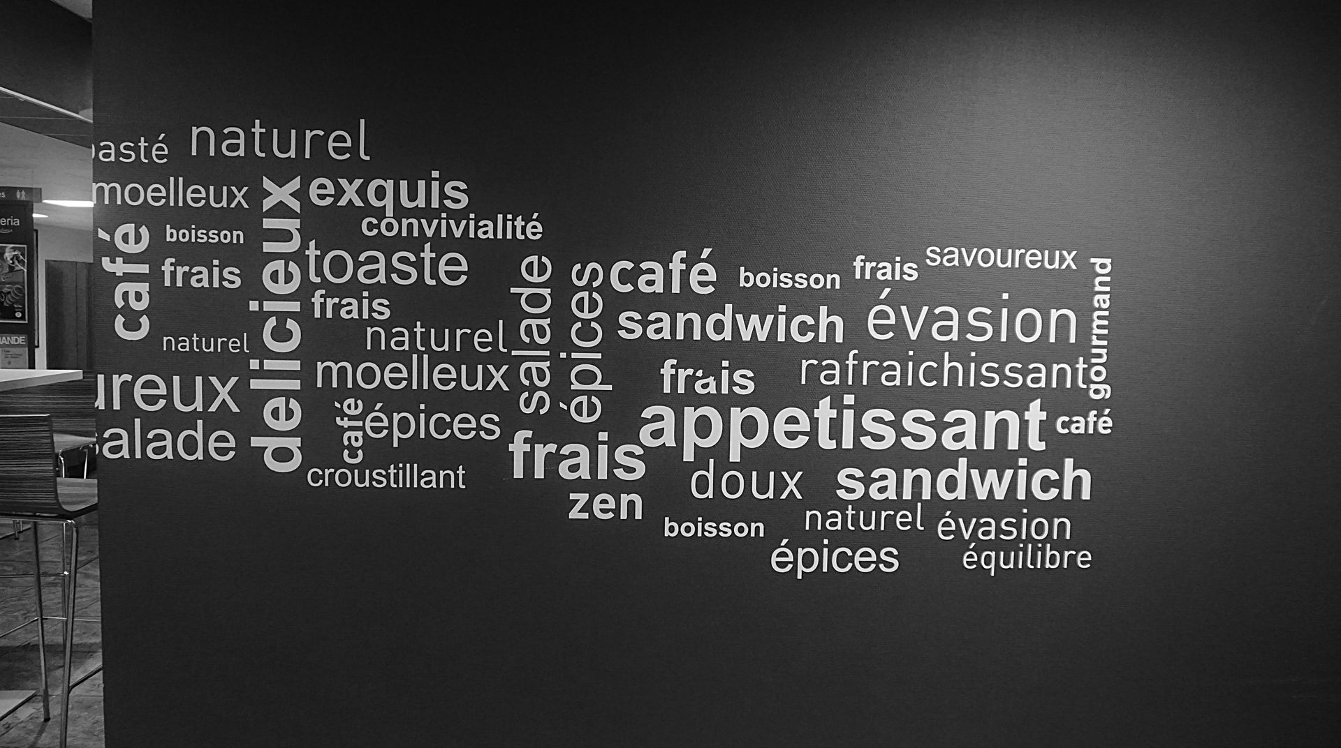
We can’t talk about visual hierarchy without mentioning typography. The fonts you choose and how you use them have a massive impact on how users navigate your website. Larger, bolder fonts should be used for headings, while smaller, more subtle fonts work best for body text.
One of our Utah clients, a medical practice, was using the same font size and weight for all their text. This made it hard for users to distinguish between headings, subheadings, and body content. By introducing a clear typographic hierarchy with varying font sizes and weights, we improved their website’s readability and user engagement.
Spacing and White Space
A cluttered website is a confusing website. Too many elements crammed together can overwhelm visitors and make it difficult for them to focus on what’s important. White space—or the empty space between elements—helps give your content room to breathe.
One of the most common mistakes we see with small businesses is overloading their pages with too much information or too many images. By adding white space and spacing out content, we make the site feel more approachable and user-friendly.
Alignment and Positioning
How you align elements on your website can either guide the user’s eye in the right direction or leave them confused. Proper alignment ensures that content flows naturally from one section to the next, making it easier for visitors to understand your message.
When we worked with a law firm in Salt Lake City, their website had a disjointed feel due to inconsistent alignment. By organizing the content with clean, aligned sections, we helped create a more professional and cohesive look, which ultimately led to more clients contacting them through the site.
How Visual Hierarchy Impacts User Experience and Conversions
At the end of the day, your website’s success boils down to two things: user experience and conversions. User experience (UX) is about how easy it is for someone to navigate your site, while conversions are the actions they take—buying a product, filling out a form, or signing up for a service.
Visual hierarchy is the key to improving both.
A well-structured site with clear headings, contrasting colors, and well-sized buttons makes it easier for users to find what they’re looking for. When visitors can navigate your site easily, they’re more likely to stay longer and engage with your content. And the longer they stay, the more likely they are to convert.
We’ve seen this firsthand with businesses in Utah that rely on ecommerce websites or professional service websites, where guiding users to essential information—like product pages or booking forms—is critical to their success.
Common Visual Hierarchy Mistakes to Avoid
Over the years, we’ve seen a few common mistakes that businesses make when it comes to visual hierarchy. Here are a few to watch out for:
- Too Many Elements Fighting for Attention
You want to highlight your products, but if everything is bold, colorful, and large, nothing stands out. Prioritize what’s most important on each page and scale back the rest. - Lack of Contrast
If your CTA buttons blend into the background, users might not even notice them. Make sure there’s enough contrast to highlight key elements. - Ignoring Mobile
Visual hierarchy isn’t just for desktop users. Responsive web design is crucial, especially in a world where most people browse on their phones. Make sure your typography, buttons, and other elements adjust properly on smaller screens.
Visual Hierarchy for Mobile and Responsive Design
Speaking of mobile, ensuring your site is optimized for mobile users is more important than ever. On smaller screens, space is limited, which makes a clear visual hierarchy even more crucial.
We often recommend simplifying the design for mobile, ensuring that key elements—like headings, buttons, and CTAs—are easy to find without having to scroll endlessly. A responsive site that adjusts the size and positioning of elements based on the device improves user experience and increases your chances of conversions.
How Bear Byte Studios Can Help with Visual Hierarchy
At Bear Byte Studios, we specialize in helping Utah businesses create websites that work. Whether you’re in need of a website redesign or starting from scratch, our team of expert web designers and graphic designers can guide you through the process of building a visually appealing, user-friendly website.
We’ve worked with businesses across a range of industries, from medical practices to ecommerce shops, and we know what it takes to create a site that not only looks good but also drives results. Our approach is customized to your needs, ensuring that your visual hierarchy aligns with your brand and business goals.
Get Your Website’s Visual Hierarchy Right
Visual hierarchy isn’t just a design principle—it’s a critical part of your website’s success. By using size, color, typography, and spacing strategically, you can guide visitors through your site, improve their experience, and increase your conversions.
If you’re a business owner in Utah looking to take your website to the next level, contact Bear Byte Studios today. Let us help you create a website that not only looks great but performs even better.


